
Guide - Our quick guide to background replacements in Photoshop
- Mar 28, 2020
- 2 min read
Background replacements are sometimes essential and others they’re an aesthetic choice. Today I am going to show you how to make a seamless background composition.
1.The Background.
Picking your background is key. You can either go with a colour setup or an image. If you are using an image it is vital you make sure the distance and angle match the subject. Dropping a person next to an oak tree which is on the same focal length but their height will not fool the eye. You also need to make sure the lighting situation reflects yours. A rim lit object vs a front lit object wont work.
2. The Tools.
You need photoshop and a basic understanding of it. It can’t be done in lightroom or elements, especially for complex objects. When working in photoshop make sure you’re using 16bit as this will help with colour banding.
3. The Image.
Always try and shoot raw. There may be some colour matching required ad jpeg won’t hold up.
Lets Get Started…
This image was taken on my last photo shoot

As you can see, I have a nasty white streak, boring wall and garage door. I don’t want this.
In photoshop I began by using the path tool to make a selection of the windows.

On these masks I feathered them by 2px to give them a slight soft edge. Too sharp and it would look a little off to the eye.

Still selected, I selected the main file and applied a layer mask. Sometimes it will mask the wrong area. Simple press CRTL+I.

Make a new layer under this to start your background. I originally used a simple coloured gradient. I did this by selecting the darkest blue in the interior and creating a solid fill layer.

You need to identify where the light is coming from. Here it is the roof edge.

On a new layer I opened up the colour swatch with the dark colour selected and turned up the brightness. I then used the gradient tool on Radial dragging it down from outside the canvas to create a soft glow. To stop gradient banding, I applied a 2% noise to the layer.

Now you have a nice coloured background replacement.
Adding a photo instead.
Adding a photo can be more difficult as you need to build in realism. For example.. this doesn’t work.

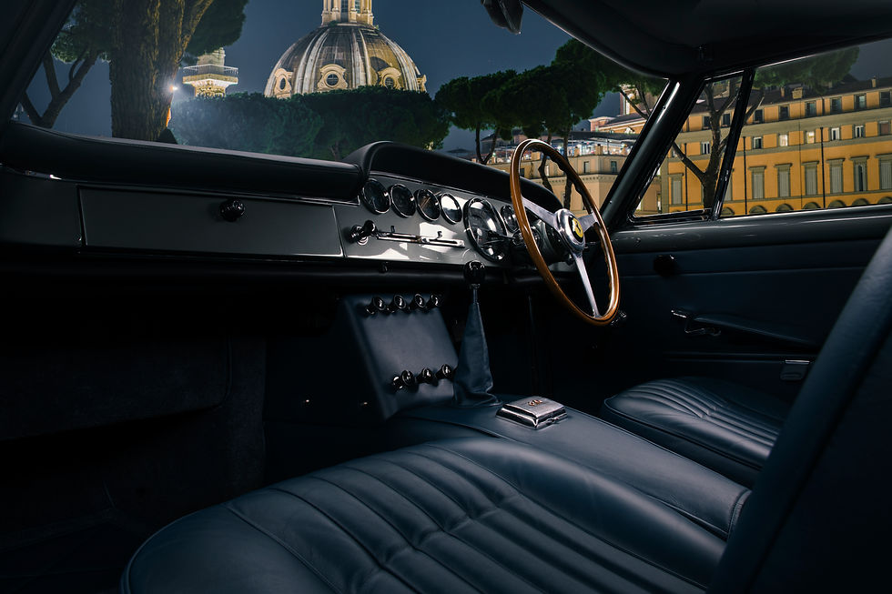
In this photo my angle is low and up. This image is straight on and slightly down. The light is right though. It will take you a while but images are out there and free to use. I used one from envato of Italy at night.

The image is dark with multiple light sources pointing at the cars direction. The only issue is it is tack sharp! The fore ground and background can not both be in focus. I applied a slight gaussian blur to reduce the image and place it frame.

The background is too prominent. Using layer adjustments, I dropped the images saturation and blended the hue.

To blend the image more so I noticed there was a light on the left. I used a radial gradient from the source to create a soft bloom. I also applied colour luts to the image and a few more adjustments to come up with this…


Comments